本文翻译自 Layout React Native Components with Flexbox - Konstantin Shkut
正文如下。
使用 Flex 布局你可以将任何组件定位到屏幕中的任何位置。你可以将它们垂直排列、水平排列、居中放置、均匀分布,等等。
目录
- 什么是 Flex 布局
- 起步
- 定义样式
- 主要弹性容器
- 理解弹性容器
- 导航栏
- 垂直居中与水平居中
- 标签栏
- 理解弹性布局
- 理解对齐容器
- 主轴和副轴
- Justify Content(主轴内容对齐)
- Align Items(副轴内容对齐)
- 总结
什么是 Flex 布局
CSS3 弹性布局,是一种元素排布的布局模式,用于元素的展现可预测(固定的)且页面布局需要适应不同的屏幕尺寸或者显示设备的情况。
起步
从创建一个新 app 开始。开启 终端 运行下面的指令来初始化一个新工程,并且在模拟器中运行。
|
|
应用运行起来后,按住 ⌘ + D ,选中 Enable Hot Reloading。这将帮你节省一些时间当你在每次更改代码手动重载的时候。
打开 index.ios.js 文件并用下面代码覆盖原本的内容。
|
|
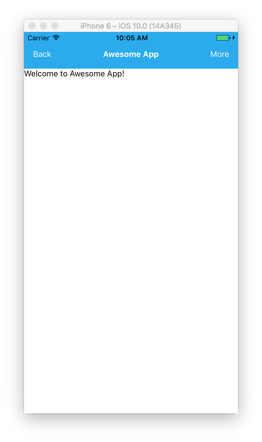
如你所见,画面中有一个带有 container 样式的 View 组件,并且包含 navBar 和 content 两个 View。navBar 有 3 个位于左右两边的 Text 组件,分别是navBarButton 样式的按钮或者 navBarHeader 样式的头部。最后,content View 的内部有一个 Text 组件。
接下来我们来看看进展如何。
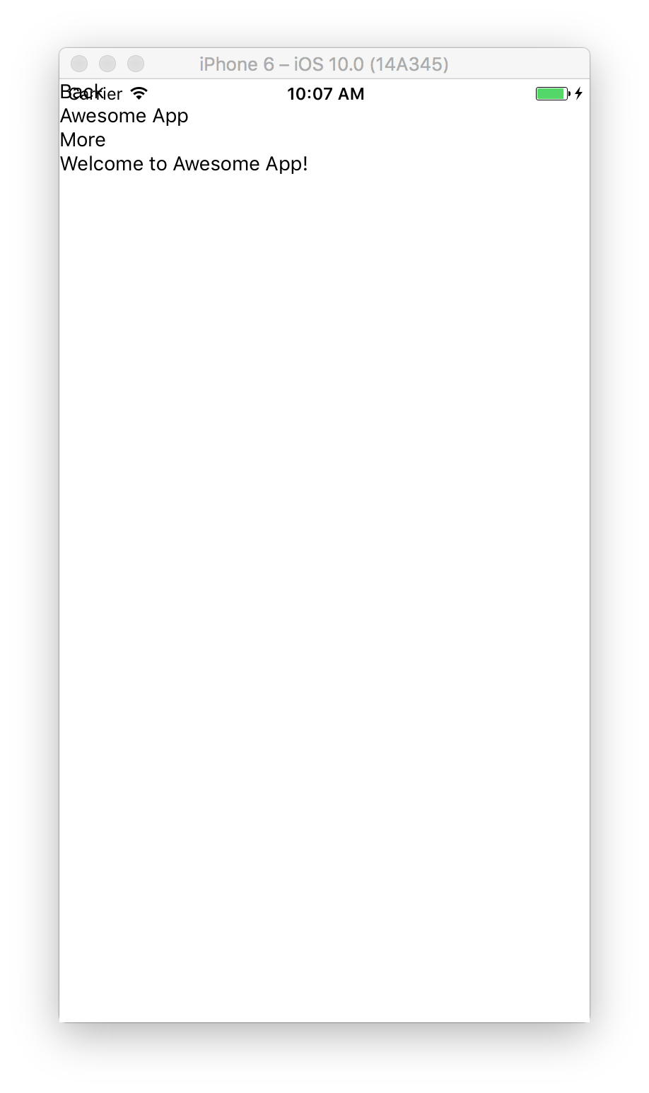
看起来并不是很给力。这是因为我们还为定义上面提到的样式。所有组件默认在垂直方向上堆叠在一起。
定义样式
我们在之前定义的 styles 中添加样式。
|
|
主要弹性容器
首先,添加 container 容器的样式。
|
|
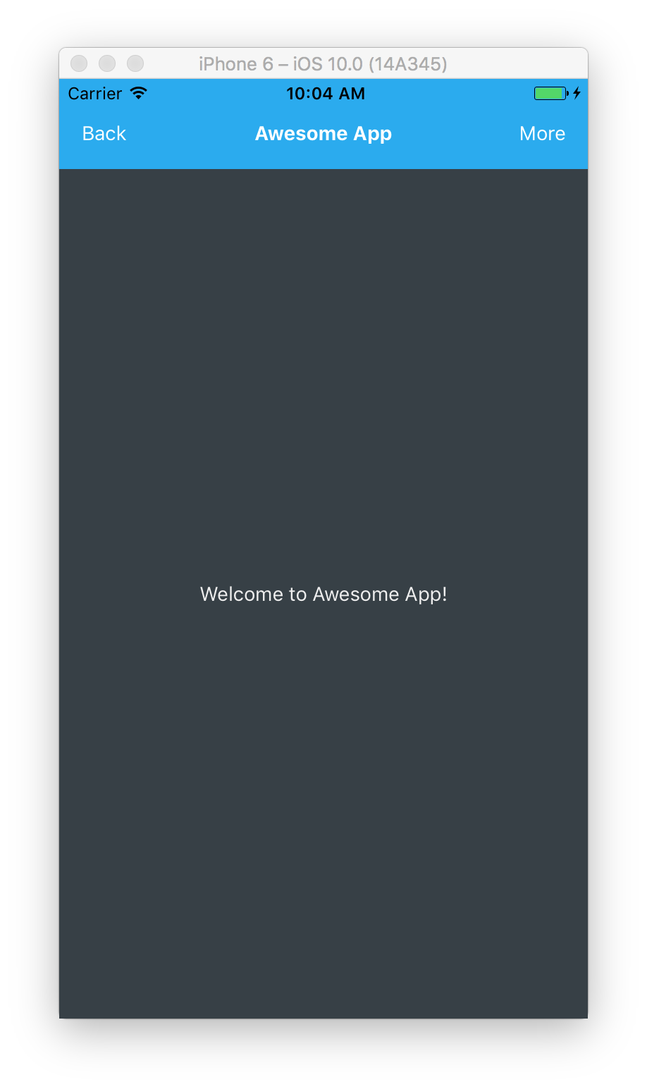
flex: 1 表示该容器是弹性的并将充满屏幕的所有空间。因为 container 容器的背景是白色的,所以你看不到任何变化。
理解弹性容器
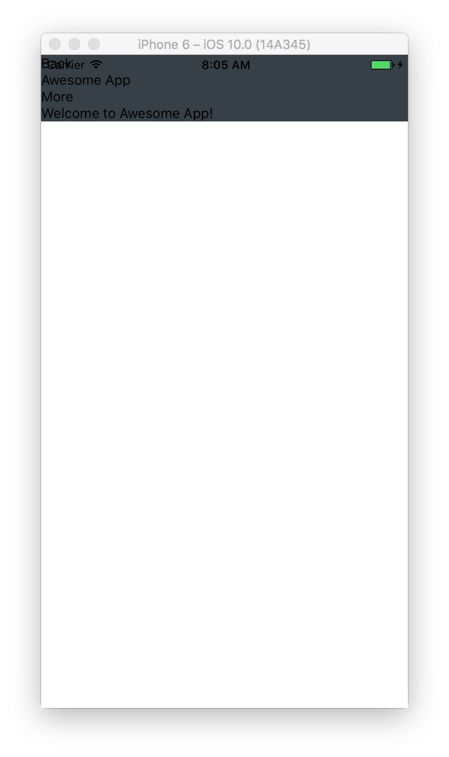
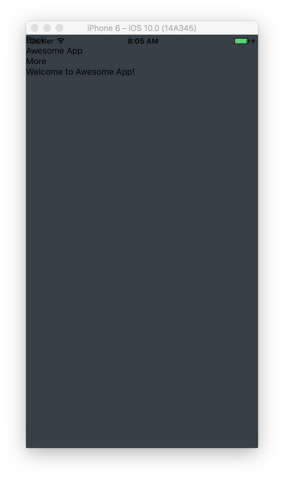
为了说明弹性容器的工作原理,我们来看一下下面的例子。我们改变 container 容器的背景并且把 flex 设置为 0 或者 1。
    container: {
      flex: 0,
      backgroundColor: ‘#374046’
    },
    container: {
      flex: 1,
      backgroundColor: ‘#374046’
    },
左边的 container 容器 flex 值为 0,它所占的空间为所有子元素所占空间的和。相反的,右边 flex 值为 1 的 container 容器占据了屏幕中所有的有效空间。
导航栏
我们在屏幕的上方添加一个导航栏,并添加 narBar 样式。
|
|
我们设置总高度为 64,上边距 paddingTop 为 30 来保持与状态栏的距离。同时设置布局方向 flexDirection 为横向 row,这将使导航栏 narBar 的所有子元素按水平而不是垂直方向排列。系统默认 flexDirection 的值为纵向 column,子元素按垂直方向排列。
下面再看看进展如何。
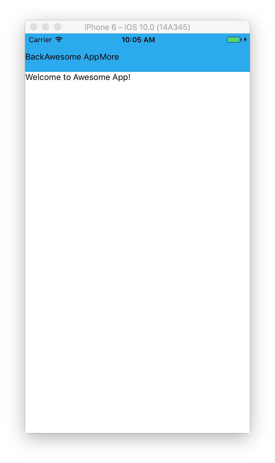
看起来比刚才的强点,但是我们想要的效果是按钮在两边,头部在中间。所以还是得加一些样式来实现。
|
|
我们再设置按钮的宽度 width 为 64,头部的 flex 值为 1,这样做的效果是头部将会占据按钮之间的所有空间。
看起来好多了。
垂直居中与水平居中
接下来,我们要让欢迎内容再屏幕中居中。我们给内容和文本容器添加一些样式。
|
|
我们设置 flex 为 1 来占据屏幕中的所有空间,justifyContent 为 center 来垂直居中子组件,alignItems 为 center 来使它水平居中。
当你把
flexDirection设置为row模式时,justifyContent与alignItems的效果刚好相反。justifyContent用来使子组件水平对齐,而alignItems用于垂直方向。
下面看一下应用的效果如何。
看起来相当不错。
标签栏
现在,我们在底部添加标签栏。在 <View style={styles.content}> 的关闭标签 </View> 后面添加一个 View 组件。
|
|
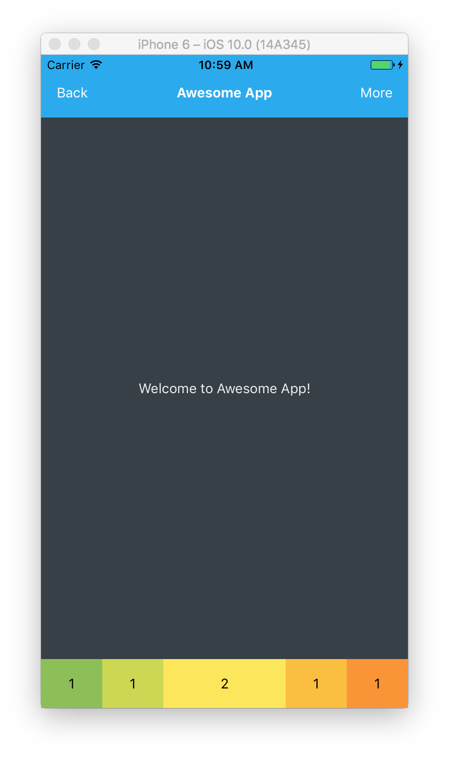
我们添加了一个带有 tabBar 样式并且有 5 个 View 子组件作为按钮的 View 组件。每个按钮有两个样式,第一个样式都是 tabBarButton,第二个样式分别为 button1 到 button5。
当你想要给一个组件使用多个样式时,你可以使用一个用逗号
,分隔开的样式数组,如style={[styles.tabBarButton, styles.button1]}。
接下来定义样式。
|
|
我们给 tabBar 定义一个固定的高度,将 tabBarButton 的 flex 值设为 1, 这将使每个按钮均等地占据有效空间。同时我们给每个按钮设定各自的颜色。
大概是下面这样。
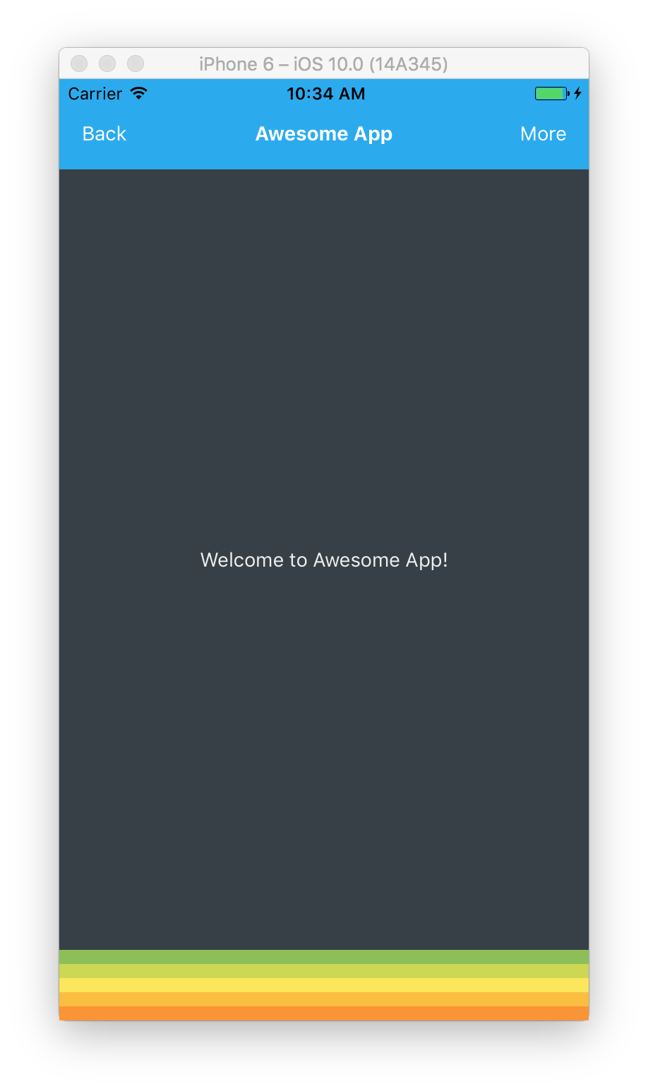
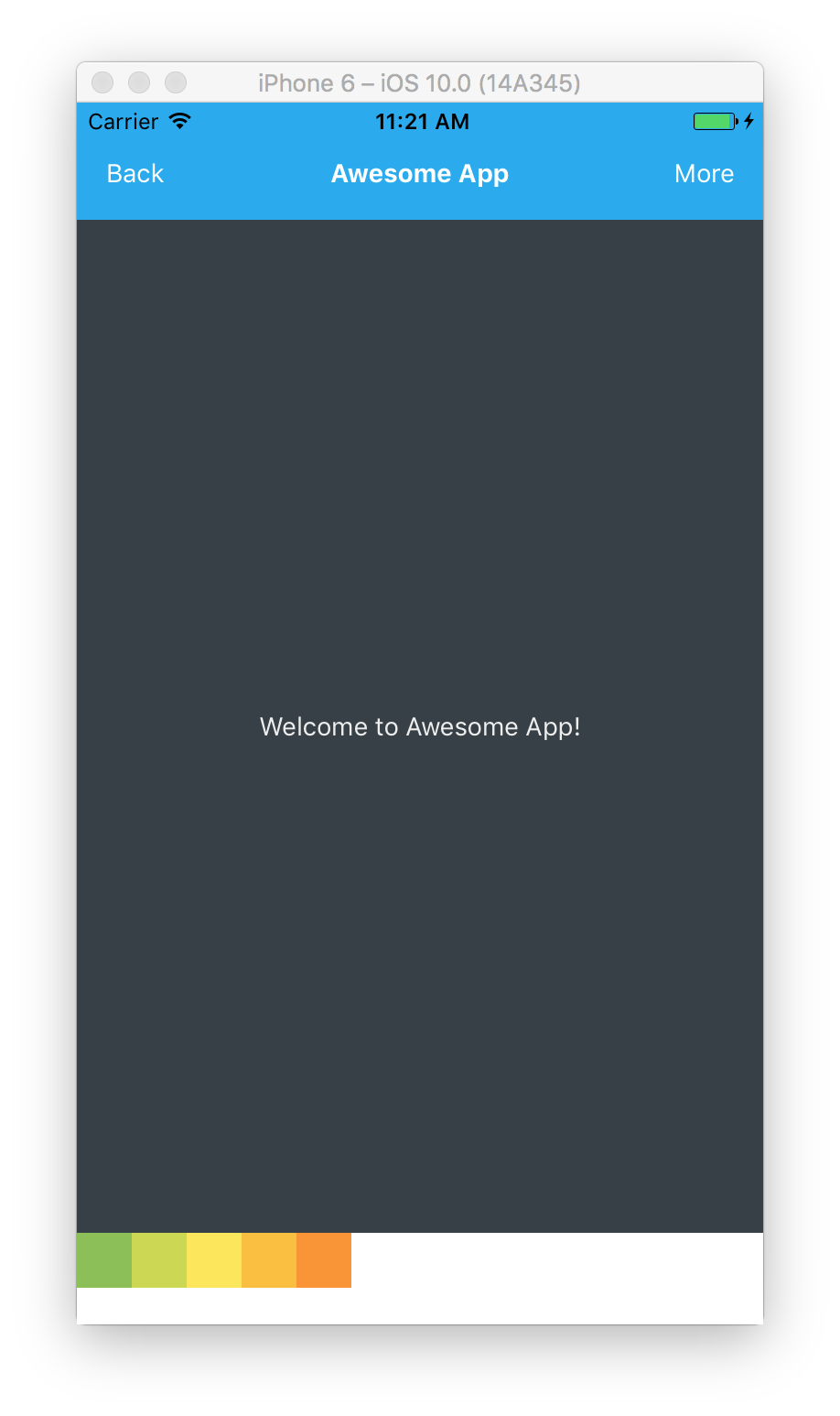
呃,所有按钮都按照默认样式垂直堆叠着,这并不是我们想要的结果。让我们把 flexDirection 设置为 row 来使按钮水平排列。
|
|
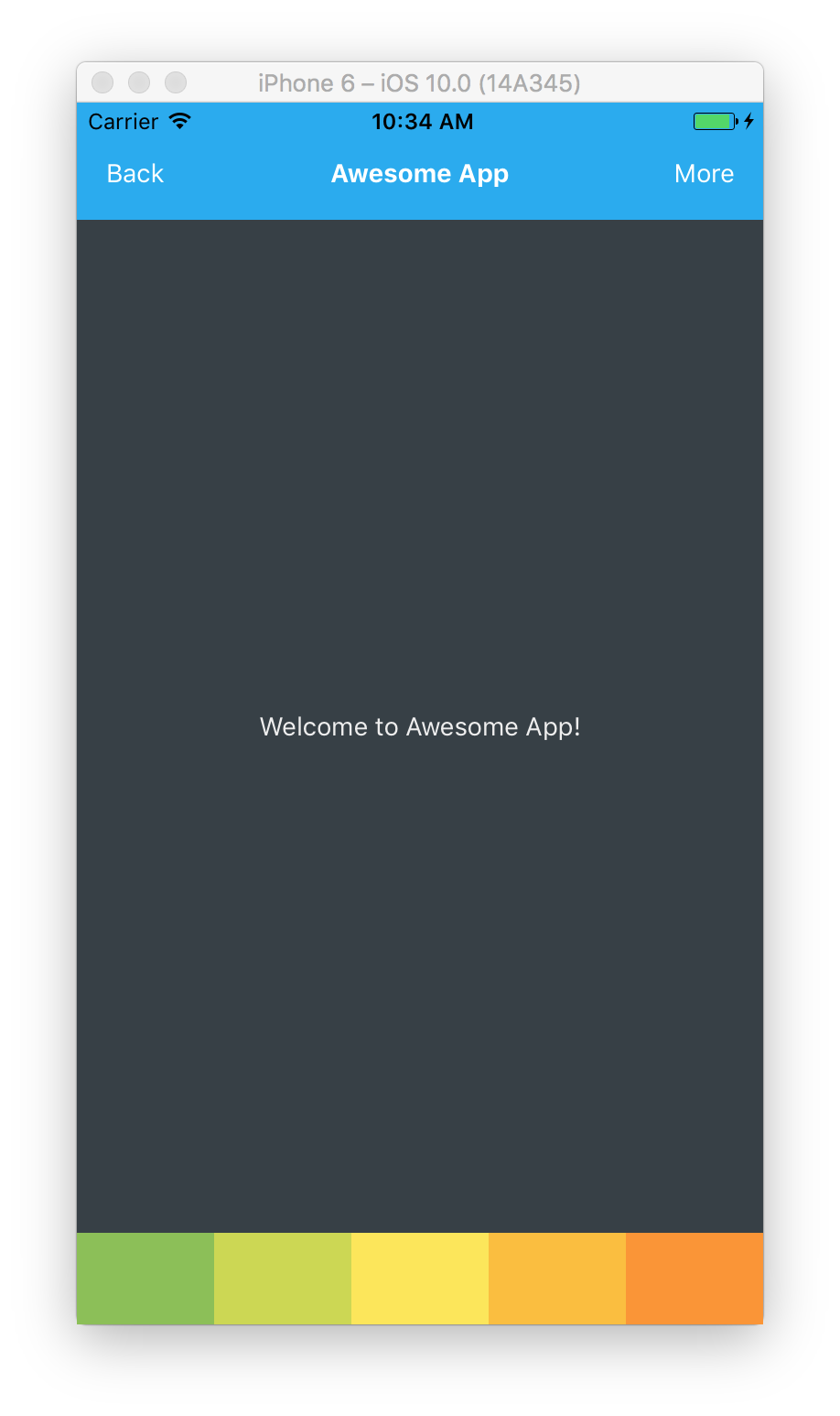
看吧,这就很不错了。
理解弹性布局
当我们将每个按钮的 flex 设置为 1 时,它们将均分地占据尽可能多的空间。如果我们想让第三个按钮的大小是其他按钮的两倍的话,可以将其 flex 设置为 2。
|
|
那么会是下面这样。
理解对齐容器
接下来我们将 tabBarButton 从弹性盒改为固定高度和宽度。
|
|
主轴和副轴
默认的 flexDirection 值是 column,此时主轴是纵轴 column,副轴是横轴 row,反之亦然。
Justify Content (主轴内容对齐)
给一个组件的样式设置 justifyContent 属性可以控制子元素在主轴上的分布,可选值有下面几个:
flex-start(默认值)- 子元素分布在起点处。

tabBar: {
    flexDirection: ‘row’,
    justifyContent: ‘flex-start’
}
center - 子元素居中放置。

tabBar: {
     flexDirection: ‘row’,
     justifyContent: ‘center’
}
flex-end - 子元素分布在终点处。

tabBar: {
    flexDirection: ‘row’,
    justifyContent: ‘flex-end’
},
space-around - 相等空间环绕子元素分布。

tabBar: {
    flexDirection: ‘row’,
    justifyContent: ‘space-between’
}
space-between — 子元素贴边均匀分布。

tabBar: {
    flexDirection: ‘row’,
    justifyContent: ‘space-between’
}
Align Items(副轴内容对齐)
给一个组件的样式设置 alignItems 属性可以控制子元素在副轴上的分布,可选值有下面几个:
flex-start — 子元素在起点处对齐。

tabBar: {
    flexDirection: ‘row’,
    justifyContent: ‘space-between’,
    alignItems: ‘flex-start’
}
center — 子元素居中对齐。

tabBar: {
    flexDirection: ‘row’,
    justifyContent: ‘space-between’,
    alignItems: ‘center’
}
flex-end — 子元素在终点处对齐。

tabBar: {
    flexDirection: ‘row’,
    justifyContent: ‘space-between’,
    alignItems: ‘flex-end’
}
stretch (默认值) — 子元素拉伸以填充所有空间。子元素在副轴上的尺寸若为固定值,则该值无效。
结论
弹性盒对于给应用创建各种弹性布局是一个非常给力的工具。切记,默认的布局方向是垂直方向,如果需要在水平方向排布元素记得把值设为 row。
译者补充
RN(React native) 的 Flex 布局与 CSS 的稍有不同,可以认为 RN 的是 CSS 的一个子集。